

It has been 5 months since we closed on the A-Frame at Lake Arrowhead and time has flown. As we wrap up the renovations, we’d like to share with you some behind the scenes design decisions we made to get the most bang for our buck. I will say, having an architect for a husband helped immensely. 😉
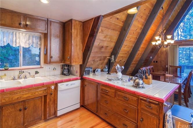
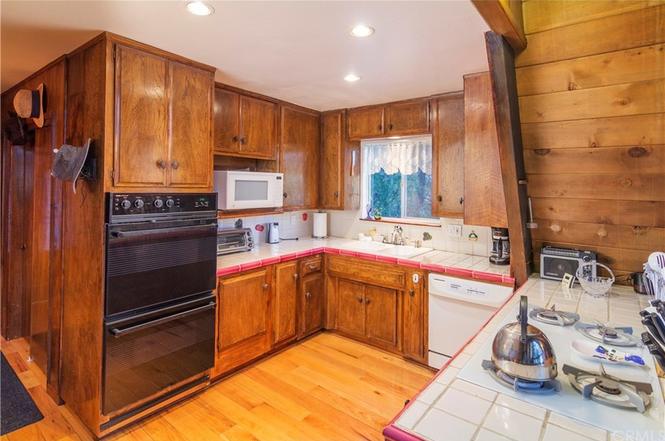
The first room transformation is my favorite—the kitchen. To give you an idea of what we’re working with, the house is a 1969 A-Frame and was built as a summer retreat to beat the southern California heat. The kitchen in the house was dark, drabby and a DIY mish-mash with dirty tile counters and a quirky peninsula. At first, we thought we could just paint the cabinets, but after opening up the doors we knew we had to completely start over.
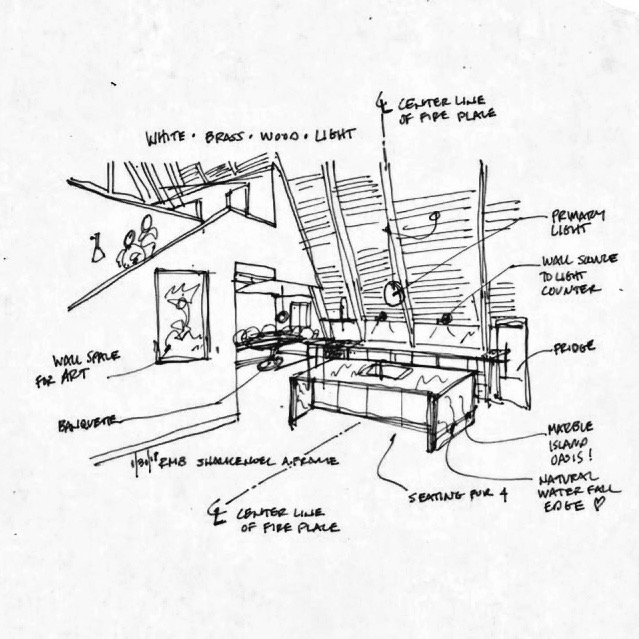
Thankfully Reid was up to the challenge of designing my dream kitchen and started sketching some conservative ideas. We started the design process thinking we would keep everything as is and only update cabinetry, countertops and appliances. But as we continued to sketch (and re-sketch), my desire for an island started to change things and Reid just couldn’t make it work with the original layout. To bring this 1969 A-Frame into 2018 we knew the kitchen belonged in the main living space, under the amazing ceiling and across from the stone fireplace. So, Reid re-planned the space from scratch. The good news is, the sink is all that needed relocated. The fridge moved to a corner with an existing outlet and the stove location only rotated 90 degrees, so the gas line only required minor modification.
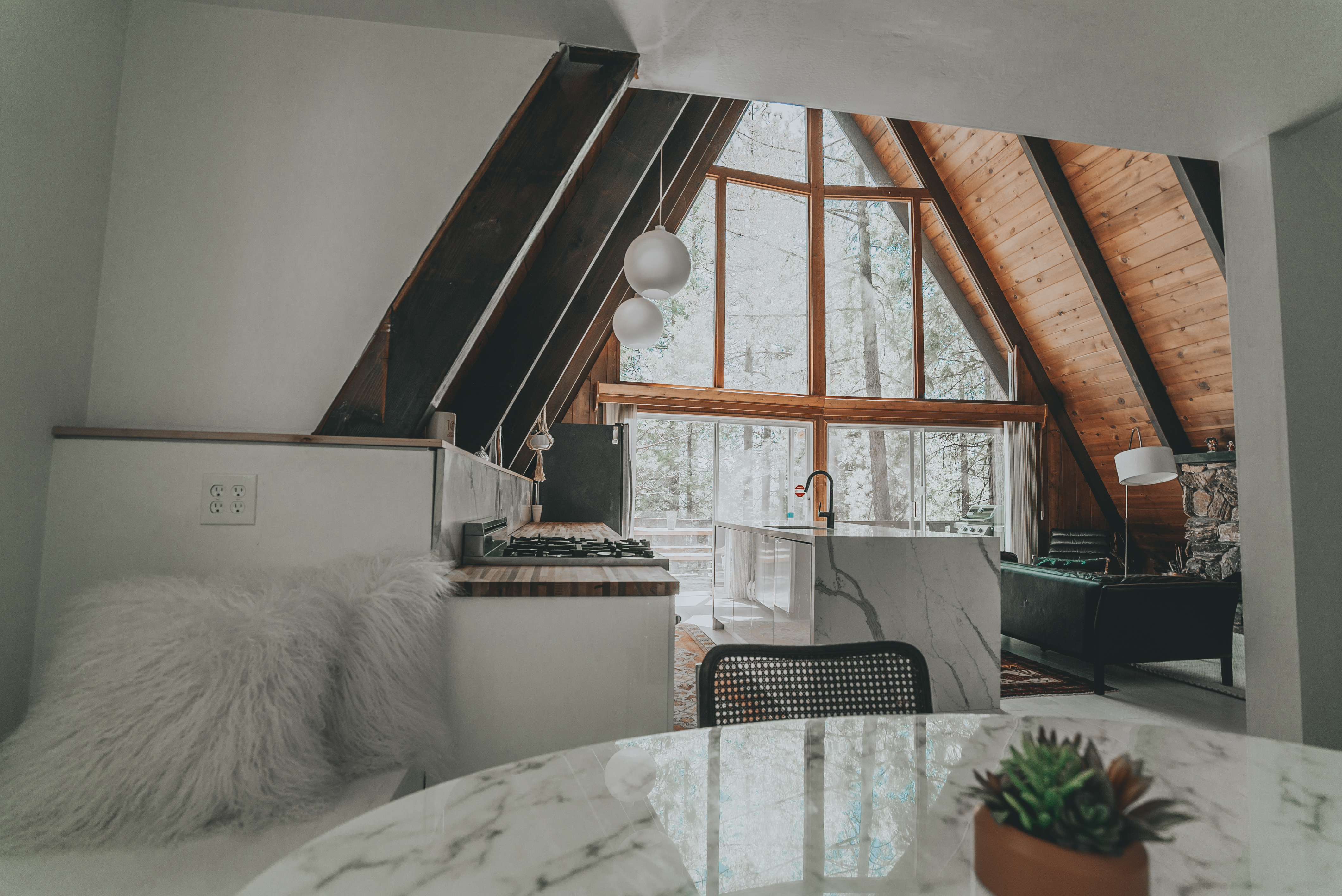
Reid stayed true to general rules for kitchen design using the “working triangle.” If you’re not sure what that means, it’s when the location of the stove, sink and fridge form a triangle and create an easy flow for working in the kitchen. As a bonus, the sink aligns perfectly on center with the fireplace and the view from the sink is beautiful—something I’ve never had in a house before.
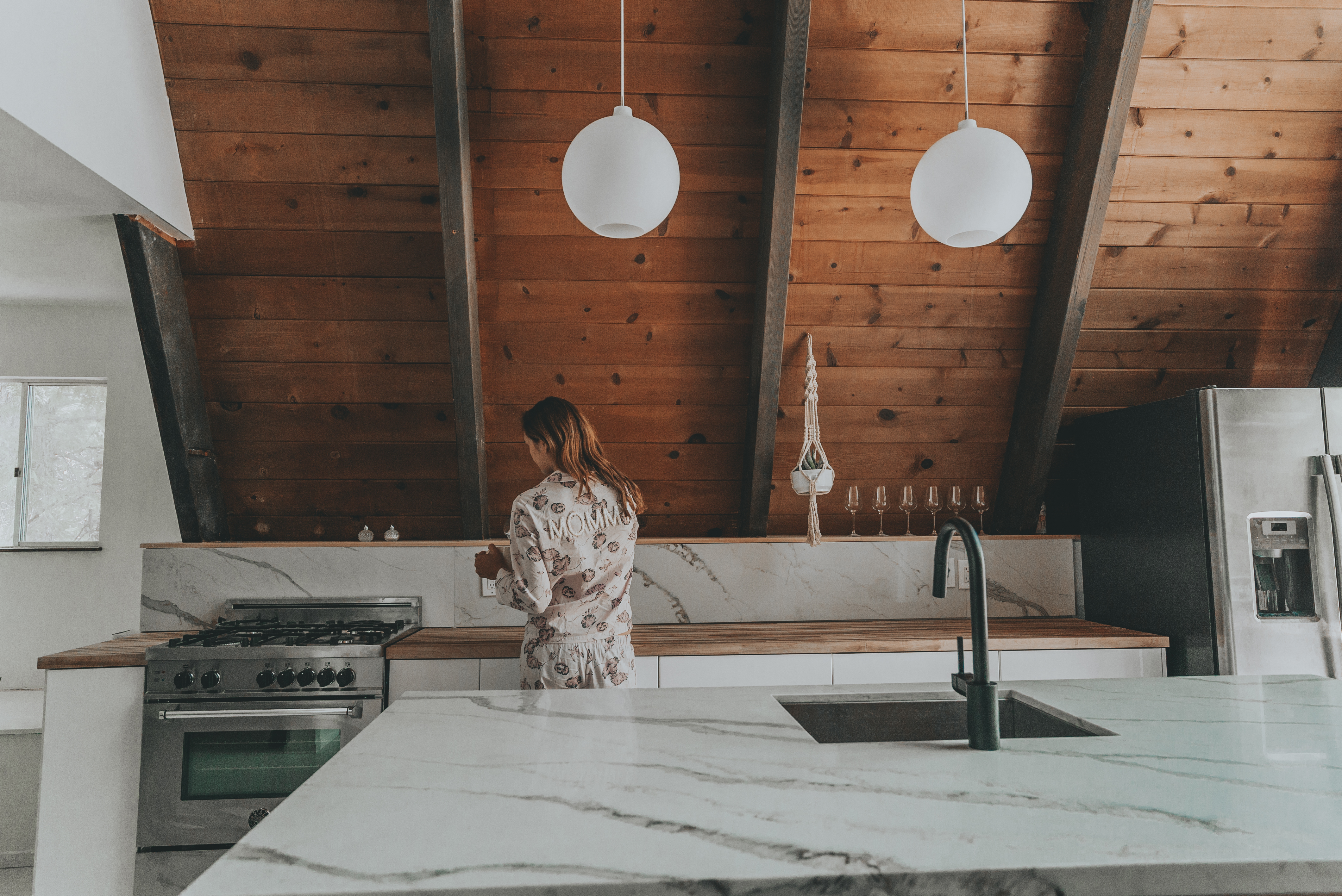
To maintain symmetry, we flanked the stove and fridge on opposite sides of the sink. This gives us uninterrupted counter space, and with no upper cabinets, the space doesn’t feel crowded. The sloped ceiling made upper cabinets nearly impossible, but we did discover we could create an open shelf that would have been lost behind a wall if we hadn’t sketched everything out accurately. I would definitely suggest not skipping the sketching phase of planning/designing your space, even if you don’t have an architect or contractor in the family.
For materials we decided to go with a modern IKEA cabinet door called Ringhult. The description said it was easy to clean with kids, so we were sold! If I had to do it over again, though, I may have picked the cabinet that has the integrated door pull. Hardware is just another step and additional cost that prolongs finishing a space.
We debated on countertops for weeks. But as we were purchasing our flooring from Lumber Liquidators, we saw they had maple butcher block counters and we were sold. The price was good and the install was simple. We used the butcher block along the counter against the wall. The contrast of the natural wood and the glossy cabinet doors softened the contemporary aesthetic.
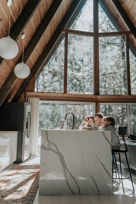
For the island, we wanted drama. After many pins on Pinterest and several Instagram saves, we looked into getting natural marble with waterfall sides. We shopped some marble yards in LA but found the prices to be ambiguous and seemingly deceptive. We came close to purchasing a couple marble slabs but had a suspicion we weren’t getting what we were paying for. My instincts (and Reid’s) said run. So we did. We ended up going with a quartz counter based on advice from some of my blogger friends. We also looked outside of LA and got a much better price for both the slabs and the fabrication. It’s a nerve-racking process, but once installed, we got the drama we were holding out for.
When it came to the hardware and faucet, we wanted modern sophistication so we chose a sleek black Moen faucet and brass half moon door handles (yet to be installed!). The Turkish runner between the cabinets adds a rustic vibe and some color—a nice balance for the more modern island. It is a cabin after all.
And finally, you may remember this post where we were deciding on his and her light fixtures. Well, guess what? We went with his choice. The round white globes float above the kitchen peacefully and offer plenty of light. The strong geometry of the spherical shape also compliments the harsh angles of the A-Frame. So, Reid was right! And a fun fact—they’re Louis Poulsen light fixtures, which is the mid-century designer behind the famous artichoke light!
Now I’m on the hunt for black Bertoia bar stools. Keep an eye out! Who wants to cook in this kitchen? Wait till you see the banquet. That will be next!
To rent our cabin on Airbnb, click here
Sources
Light “Wohlert” Louis Poulson // Stone Quartz from Stone Systems LLC “PolarStone Quartz 2CM – 120″x63″ Calacutta Manhattan 5111″ // Bar Stools
// Flooring Whitewashed Engineered Hickory from Lumber Liquidators // Runner rug Etsy // Butcher Block in Maple Lumber Liquidators // IKEA cabinets “Ringhult” // Moen Matte Black Faucet // Stove 30″ Range Bertazzoni Italia // Oval Marble Table
2 comments
I love your kitchen remodel! We are in a similar aframe and have been stumped regarding the stove/oven and an exhaust fan. Can I ask what stove you found with the built-in downdraft? Thank you!
Hi Joni
Thank you. We miss that A frame. We didn’t install an exhaust fan. The stove we installed was a Bertazzoni.